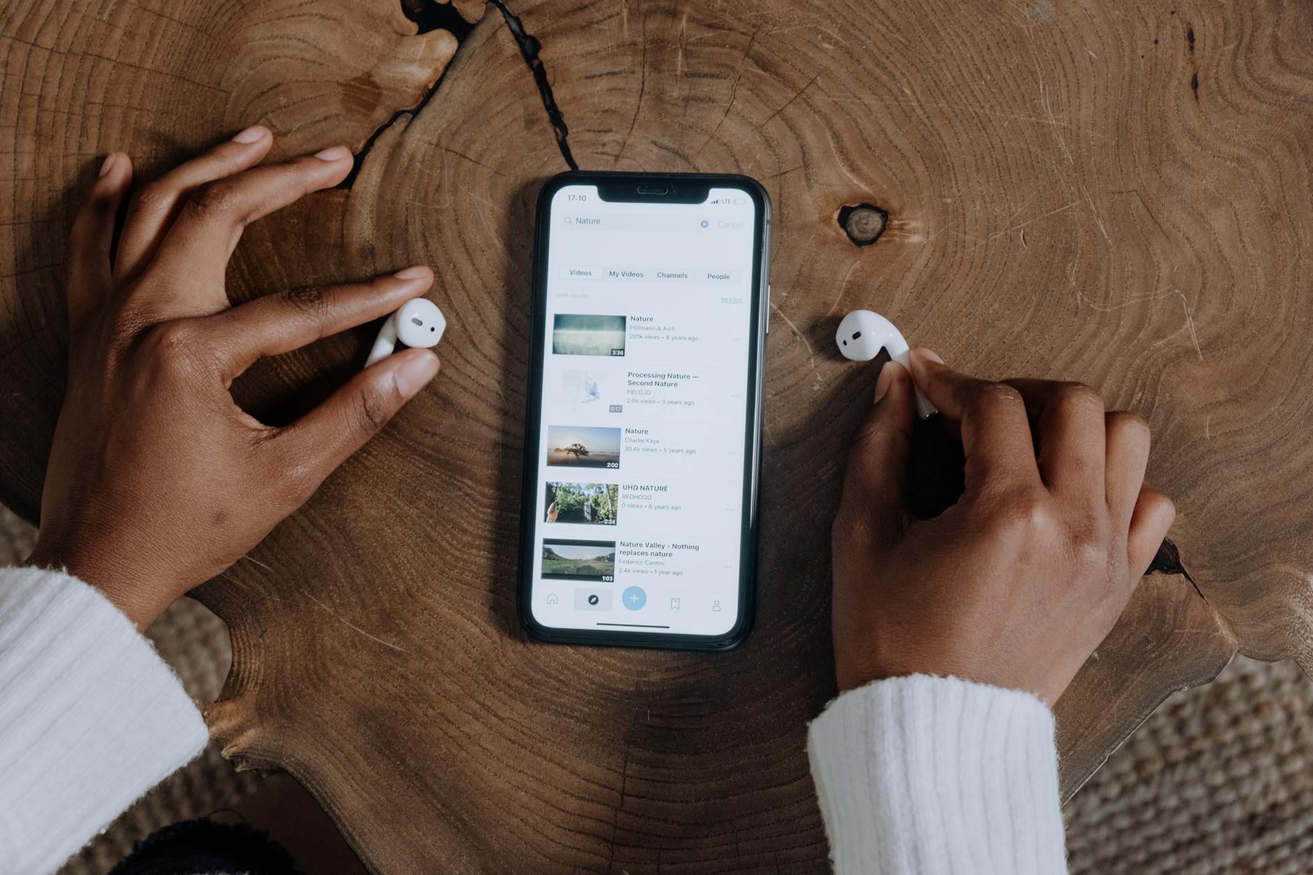
Ever tried to navigate a website on your phone and felt like you were solving a Rubik’s Cube while blindfolded? Frustrating, right? As designers, we often forget that what looks stunning on a desktop might turn into a visual nightmare on a smaller screen. Especially in a fast-paced market like California, where users are constantly on the go, creating a mobile-friendly landing page is not just a nice-to-have; it’s a must!
You might be thinking, “But I’ve got my desktop version down to an art!” Well, hold your horses. Designing for mobile is a whole different ball game. It’s like trying to fit a surfboard in a Prius—possible, but you have to know how to make it work. So, let’s dive into some golden nuggets of wisdom that can help you craft a landing page that doesn’t just attract but also keeps your visitors engaged.
First off, let’s chat about the importance of speed. Did you know that 70% of users admit that page speed affects their willingness to buy from an online retailer? Think about it. You click on a link, and if it takes longer than a few seconds to load, you’re already thinking of abandoning ship. Keep your designs clean and optimized. Compress those images! Use tools that help with speed optimization. Your visitors will thank you, and you’ll see that bounce rate drop!
Now, onto layout. If your landing page feels cramped or cluttered, it’s like trying to dance in a phone booth—just not gonna happen! Prioritize what really matters. Use a single-column layout to guide users’ eyes down the page. And hey, don’t skip on those white spaces! They aren’t just empty; they’re breathing room for your content, making everything feel more approachable.
- Mobile-First Design: Always consider how your design will look on a smaller screen before you even think about the desktop version.
- Touch Target Size: Make sure buttons and links are big enough for fingers—not just mice!
- Clear Call-to-Action: Make that CTA button pop! If it’s not visible, it doesn’t exist.
- Readable Text: No one wants to squint to read your content. Use legible fonts and appropriate sizes.
And here’s a little secret: storytelling! You want your landing page to resonate with your audience, right? Imagine a scenario where a visitor lands on your page, and instead of just seeing a bunch of text and a button, they’re welcomed into a narrative that speaks to their needs and desires. Use visuals and engaging copy to tell your story. You could even incorporate local elements—like a nod to California’s vibrant culture—to create a genuine connection with your users.
Finally, let’s talk about testing. You wouldn’t serve a dish in a restaurant without tasting it first, would you? The same goes for your landing pages. A/B testing is your best friend. Change up those headlines, tweak colors, and see what resonates best with your audience. Analyzing user behavior can give you insights that you never even thought of!
So, the next time you sit down to design a landing page, remember: it’s not just about the aesthetics. It’s about creating an experience that feels seamless, engaging, and downright enjoyable. After all, in this digital age, we’re not just selling products; we’re selling experiences. And who wouldn’t want to be part of a memorable one?


Leave a Reply